Histogram in DSLR
Apr 17, 2018 Written by Ashish rai histogram in DSLR
Share 

Histogram in DSLR
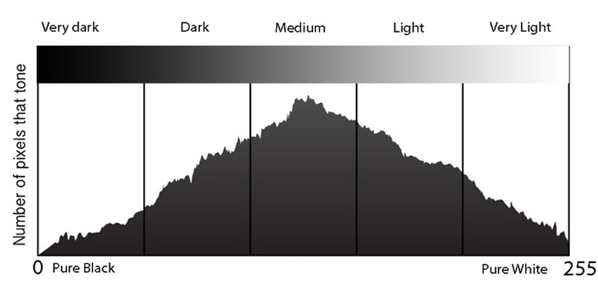
- A histogram is a graphical representation of the pixels exposed in your image. The left side of the graph represents the blacks or shadows, the right side represents the highlights or bright areas and the middle section is mid-tones (middle or 18% grey).
- There are many things we can learn about an image just by looking at the histogram.We can tell an image is well exposed if it reaches fully from edge to edge without a space on one side of the graph, and isn’t heavily going up one side or the other.
- Gaps on either end indicate you are missing information and your exposure can be shifted safely without losing detail. When your graph is shifted too far in one direction or the other so that it does not even touch the other edge
- Spikes up the left or right edge indicate “clipping” of that tone and loss of detail in that area. Clipped areas are often unrecoverable, especially in the highlight area but it is generally advised to expose so you your graph just touches the right edge and keep your highlight details
- This graph shows an image with extreme contrast, lots of blacks, a spike of white and not much in the middle.
- To help you establish how far to go in the image brightening direction, most SLR cameras have a setting called “highlight warning”. It will make any overexposed highlights “flash” or blink when you preview your images on your camera screen.
- By using the tools your camera provides for you, it is easier to see how to adjust your image exposure. There is a lot more to know about the histogram, and you can use it when you process your images in Photoshop or Lightroom as well.
- Knowing how to read your camera's histogram is the most important thing you can do to ensure a good exposure. Your camera gives you the option to show the range of brightness in your image as a graph, which plots the light levels from jet black, on the left, to pure white, on the right.
- Typical Histogram Shapes and What They Mean. Normal. A common pattern is the bell–shaped curve known as the “normal distribution.” In a normal distribution, points are as likely to occur on one side of the average as on the other.
- The figures below show an example of a histogram and a bar chart. Histogramsare used to show distributions of variables while bar charts are used to compare variables.